In data science, or any related quantitative field, we strive to understand and leverage our data for our objectives. These data will usually be part of a bigger project that we’re working on where the workflow looks something like the following:
- Obtain data
- Explore data
- Research/create data product
- Fine tune project and release
- Rinse and repeat
Each step is critical and sequential where the assumptions and decisions made early on will affect the subsequent steps, for better or worse. Data collection is the most important step, where the metrics and methods determine what can be done with it. In each sub-field of quantitative analysis, be it academic sciences or industry, the data collection processes can vary drastically. Conversely, the exploratory data analysis phase is universal and can be broken down to several basic components: basic statistics, graphics, hypotheses formulation, and assessment of the best models/approaches to use for objectives.
Before moving on there is one caveat: Never trust data at face value. Always be skeptical and keep an eye out for any suspicious anomalies throughout. Furthermore, ensure that your understanding of the data is correct. For example, you may see data labeled as “Date” with values like “2015-01-04” and later find out that it is in GMT and not your local time zone. You can fit a model to bad or misconceived data, which means that no matter how well your predictions perform, they will be incorrect. Even if the model is right in some cases, it will be right for the wrong reasons.
Anscombe’s Quartet: The power of graphics
Some data properties that would be obvious when visualized can be overlooked with basic statistics. A classic example of this is Anscombe’s Quartet. This data set comprises of four different groups (I, II, III, and IV) with X and Y features.
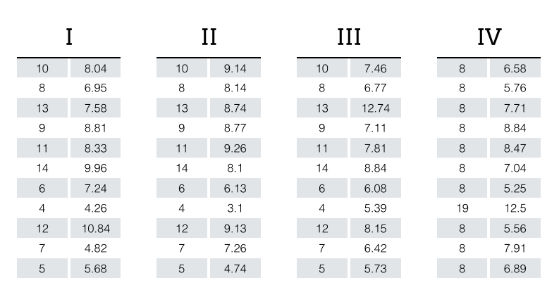
Despite the obvious differences between the four groups, summary statistics and even linear fits to the data are identical to the second or third decimal place.
Group I, Group II, Group III, and Group IV
Mean x: 9.0
Mean y: 7.5
Variance x: 11.00
Variance y: 4.13
Correlation between x and y: 0.816
Linear regression coefficients: \( Y = 3.00 + 0.50\,X \)
The graphic1 below highlight the differences clearly. If we had not visualized the data we could have assumed that the groups were the same.
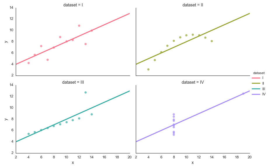
Imagine that each group had one million rows. Checking the data manually at this volume wouldn’t be effective. Visualizing the data with simple graphics to show the right context is key in this process. The code used to generate the stats and graphics can be found here.
Anscombe’s Quartet would be unlikely to occur in the data we work with, but it could be close. Close enough that one may conclude that the differences or similarities are small and make assumptions that can impact a project negatively.
Show me the data
A simple graphic is analogous to a simple sentence: Concise and to the point. A complex graphic is like a run-on sentence where the message can be lost amongst the audience. Hence, it’s important to keep your graphics simple. When you do this, you are better informed and can quickly work through the data exploration.
At Stitch Fix, we interview a lot of candidates and love giving them problems that make them think. For example, we give them a dataset that has generic labels, which is either generated or anonymized. In the data there are nuanced statistics that the candidate can find, or better yet show us something that we didn’t see before. The data challenges have no wrong or right answer. We want to see what the candidate can do and how they would approach a problem where there’s no obvious solution.
As a sanity check, we’ll do the data challenge ourselves to make sure that what we’re asking the candidates to do is feasible. In one test I looked at a tabular dataset we’ve given out before and came up with the following graphics to get an overview of the data. We refer to the columns in the data as features.
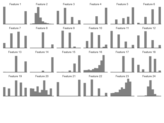
From the graphic above I can quickly assess which columns in the table are binary, categorical, or continuous. I can also identify distributions, which influences the kind of assumptions we can make for later stages of analysis.
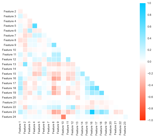
Viewing pairwise correlations between the features can be cumbersome when there’s a lot of them. The correlation matrix is a wonderful way to visualize the pairwise correlations into a dense yet readable form. The most strongly correlated features are in blue and the inversely correlated are in red. Values that show no correlation are white. This matrix tells us about the relationships between the features in the data.
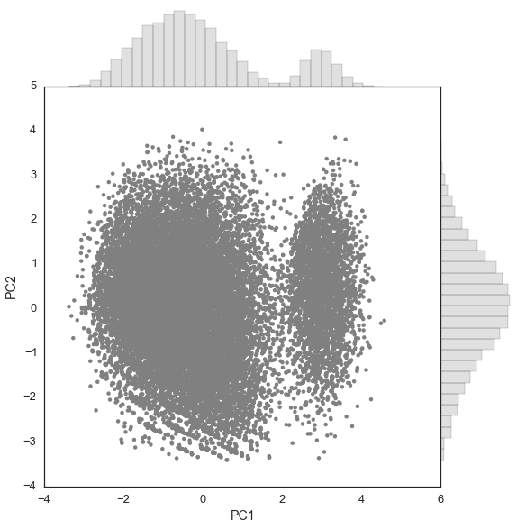
To find the subset of features that explain the bulk of the variation in the data, I use principal component analysis (PCA). It’s a simple yet powerful tool. Using a scatter plot is the ideal way to visualize a PCA of data projected onto two components. In this case we have a high number of observations, so I place histograms on the top and right side to represent PC1 and PC2 components, respectively, to ensure that I don’t miss any obvious densities.
At this point, I can make some educated hypotheses about the data and model it to predict certain behaviors. If I were to take the it to the production stage, I can now assess which models should be used and move forward.
Conclusion
In a nutshell, graphics are powerful for data exploration and should be combined with basic descriptive statistics. Keep the graphics simple for maximum clarity. Both tools will show us different properties that we’ll need for the more advanced stages of research and product development.
In the next post we’ll discuss how to optimize the exploratory data analysis stage through sampling.
† This post has been cross-posted on Insight.
1 All graphics shown here were made using Seaborn, a statistical graphics package in Python. ←