Python and R are popular programming languages used by data scientists. Until recently, I exclusively used Python for exploratory data analysis, relying on Pandas and Seaborn for data manipulation and visualization. However, after seeing my colleagues do some amazing work in R with dplyr and ggplot2, I decided to take the plunge and learn how the other side lives. I found that I could more easily translate my ideas into code and beautiful visualizations with R than with Python. In this post, I will elaborate on my experience switching teams by comparing and contrasting R and Python solutions to some simple data exploration exercises.
Entering the Hadleyverse
My data exploration process has the following steps: hypothesize, get data, sanitize the data, compute descriptive statistics, plot things, drill down, rinse and repeat. I will use the (in)famous diamonds dataset that ships with ggplot2 to illustrate this process in R and Python. The dataset contains the carat size, cut, clarity, depth, table, price, and dimensional measurements of around 50 thousand diamonds. Here are the first five rows of data:
Some questions that come to mind are: How does the price of a diamond vary with the carat size? How does this relationship vary with categorical variables like cut, color, or clarity? I can answer all these questions with a quick visualization, using ggplot, in five lines of code:
library(ggplot2)
library(dplyr)

data(diamonds)

diamonds %>%
  ggplot(aes(x=carat,y=price)) +
  geom_point(alpha=0.5) +
  facet_grid(~ cut) +
  stat_smooth(method = lm, formula = y ~ poly(x,2)) +
  theme_bw()
The %>% operator (gross looking!) is a pipe which simply passes the output of the left operator as the first argument to the right operator. I tell ggplot with the aesthetic mapping (aes) that my independent variable x is carat, and my dependent variable y is price. The next graphical layer (geom_point) states that I want to represent each data point as a point, to eventually form a scatter plot. Next, I facet the scatter plot (facet_grid) on cut, although I can also facet on color or clarity. Finally, I have ggplot fit a second order linear model (stat_smooth) to the data, and display the fit on top of the scatterplot. I find the language for expressing the visualization to be intuitive, and the result is beautiful:

With this simple visualization, we can quickly see that price increases with carat size, the relationship is nonlinear, there are some outliers, and the relationship does not depend too heavily on cut.
Lost in translation with Python
How can we do the same thing in Python? With Seaborn, this can be done with lmplot,
from ggplot.exampledata import diamonds
import seaborn as sns

sns.set_style("white")
sns.lmplot("carat", "price", col="cut", data=diamonds, order=2)
which outputs a markedly less beautiful visualization:

The main issue here is that the model fit, not the actual data, controls the scale of the y-axis. The model fits dwarf the actual data! Tufte would not approve. In R, ggplot automatically solves this problem for you, which makes the visualization useful out of the box without further effort. Furthermore, I find the R code easier to write than the Python code because it is composed of a combination of simple and easy to remember elements, e.g., geoms. It reads like English, and allows me to fit arbitrarily complex models to the data using the formula syntax. In Python, I always forget what the more specialized lmplot is called, and how to use it. I find that using R minimizes cognitive load relative to using Python for exploring data to quickly test hypotheses. In Seaborn’s defense, it produces more elegant visualizations than vanilla Matplotlib with a simpler API. It is also younger than ggplot2, which means it has had less time to mature.
Not convinced? dplyr will blow your mind
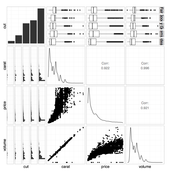
Let’s consider another example in which dplyr comes into play. Suppose we’re curious about how the cut, price, carat, and volume (a derived feature of the data) of these diamonds all covary with one another. In R, we can create a simple visualization that helps us quickly answer this question using ggpairs. But first, we need to construct a volume feature, select only the subset of the variables we care about, and sample the data to avoid overplotting.
Here’s the R code that does the trick:
library(GGally)

diamonds %>%
  mutate(volume = x*y*z) %>%
  select(cut, carat, price, volume) %>%
  sample_frac(0.5, replace=TRUE) %>%
  ggpairs(axisLabels="none") +
  theme_bw()
Again, the code reads like English. The methods mutate, select, and sample_frac (verbs!) are part of the dplyr data manipulation library, which I found very easy to quickly become proficient with. All I needed was this handy cheat sheet! I wish all libraries were this easy to learn and use.
Here’s the resulting visualization:

The function ggpairs plots each variable against the others intelligently. For example, we see scatterplots for continuous vs. continuous data (e.g., volume vs. carat) or grouped histograms for continuous vs. categorical data (e.g., volume vs. cut). On the diagonal we see kernel density estimates for continuous data (e.g., the distribution of volume on the lower right) or histograms for categorical data (e.g., the distribution of cuts on the upper left). On the upper triangle we see correlation coefficients for continuous vs. continuous data (e.g., the correlation between volume and carat is 0.996) or grouped boxplots for continuous vs. categorical data (e.g., volume vs. cut). We can learn so much about the covariance structure of our data with such an informative graphic built from so few lines of code!
Python underperforms once more
The equivalent Python code does not read like English and is super annoying to write:
rand_ind = random.sample(diamonds.index, int(diamonds.index.shape[0]*.50))
diamonds_sampled = diamonds.loc[rand_ind]
diamonds_sampled['volume'] = diamonds_sampled.x * diamonds_sampled.y * diamonds_sampled.z
diamonds_sampled = diamonds_sampled.loc[:, ['cut', 'carat', 'price', 'volume']]
sns.pairplot(diamonds_sampled, size=2.5)
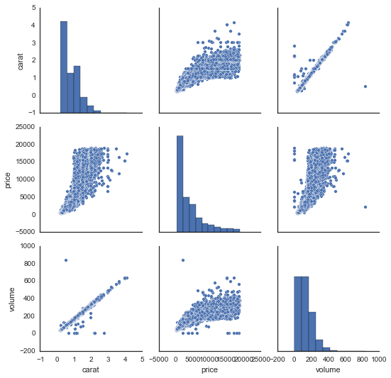
The output is also far less awesome and far less informative:

There are some big issues here. First, the pairplot command from Seaborn dropped the variable cut, because it did not know how to compare it to the continuous variables. It can only plot scatter plots for continuous vs. continuous variables. Second, the upper triangle of this grid of plots is redundant (e.g., the top right plot is the same as the bottom left plot). In R, these redundant plots are replaced by correlation coefficients or grouped boxplots, which add information. Finally, I found the aesthetics of the figure in Seaborn way too difficult to control, hence the price labels on the x-axes are bunched together. Again, the ggplot+dplyr code is easier to read, easier to write, and produces an informative visualization with intuitive code patterns.
Both languages are great for different reasons
I’m a huge fan of doing exploratory data analysis/visualization in R using ggplot2 and dplyr. Using these tools, I find it straightforward to translate my ideas from English into code and visualizations. The analogous process in Python is usually more convoluted, and the results are not nearly as pleasing to the eye or as informative. I’ve found that the ease of working in R greatly enhances my creativity and general happiness.
That being said, R also has some pretty huge drawbacks relative to Python. The language is byzantine and weird, and anytime I leave the magical world of dplyr and ggplot I start to feel the pain. Furthermore, I find it hard to automate workflows, or build reusable code. My current strategy is to leverage the best of both worlds — do early stage data analysis in R, then switch to Python when it’s time to get serious, be a team player, and ship some real code and data products.
Edits: Michael Waskom, the developer behind Seaborn, pointed out that you easily truncate the subplots in the second graphic of this post using truncate=True in lmplot.
