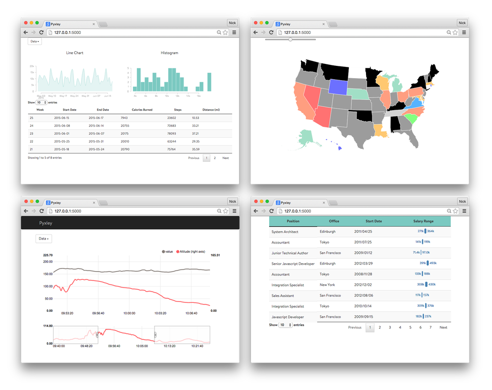
Pyxley
Web-based dashboards are the most straightforward way to share insights with clients and business partners. For R users, Shiny provides a framework that allows data scientists to create interactive web applications without having to write Javascript, HTML, or CSS. Despite Shiny’s utility and success as a dashboard framework, there is no equivalent in Python. There are packages in development, such as Spyre, but nothing that matches Shiny’s level of customization. We have written a Python package, called Pyxley, to not only help simplify the development of web-applications, but to provide a way to easily incorporate custom Javascript for maximum flexibility. This is enabled through Flask, PyReact, and Pandas.
Pyxley: React-powered Flask for interactive visualizations and reports
Most web frameworks follow the model-view-controller (MVC) pattern and lots of people use React.js as the V in MVC. For the M and C, Flask provides a great minimalistic framework for web applications that allows us to get a simple application running with only a little bit of code. Together, Flask and React.js provide a fast and flexible framework with a low barrier to entry. The focus of Pyxley is to provide a set of tools for quickly developing React-powered Flask applications.
The Github repo has a few examples, but we are going to walk through the creation of a simple line chart. To get Pyxley running, you need to get a Flask setup going (see github link for details). For this blog, we will focus on the Pyxley components that are needed for a basic dashboard.
from pyxley import UILayout
from pyxley.filters import SelectButton
from pyxley.charts.mg import LineChart, Figure
from pyxley.utils import FilterFrame
UI
Pyxley takes a modular approach where the developer specifies a list of filters and charts. We’ve created a class called UILayout that ties together all of the components for the user interface. This class is a wrapper for a parent React component composed of filters and charts. As such, we will need to provide the name of the parent component (e.g. FilterChart), the location of the source Javascript, and an HTML div name. The specifics of FilterChart can be found in the
pyxleyJS repository.
ui = UILayout(
    "FilterChart",
    "./static/bower_components/pyxley/build/pyxley.js",
    "component_id")
Filters
Pyxley is built upon the idea that you have some dataframe in memory that you want to filter with some user selected options. For this example, we have some activity data taken from my Fitbit. Assume for the sake of simplicity that the dataframe has been formatted so that it has the following columns: Date, Metric, and Value. The Metric column is a string indicating the type of data to display (e.g. Steps, Calories Burned), while Date and Value provide the actual time-series. This will allow us to select the desired Metric to plot.
# items contains the possible selections
# Args: Label, Items, ColumnName, Default
btn = SelectButton("Select Metric", items, "Metric", "Steps")
ui.add_filter(btn)
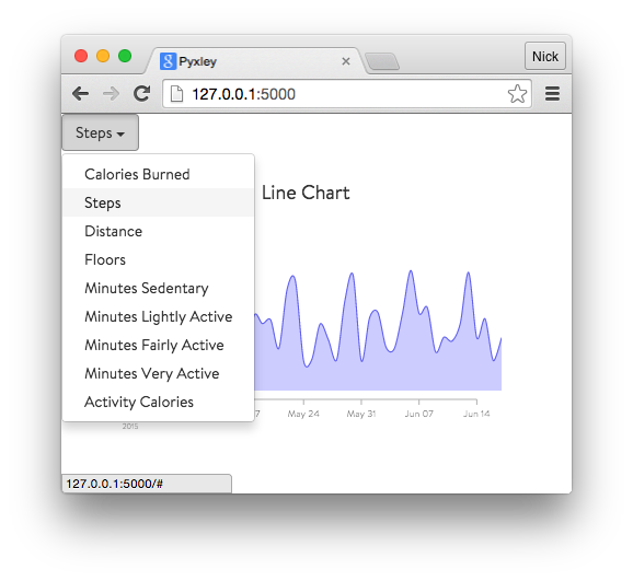
We now have a button, labeled Select Metric, containing a drop-down list of items that we will use to filter the dataframe.
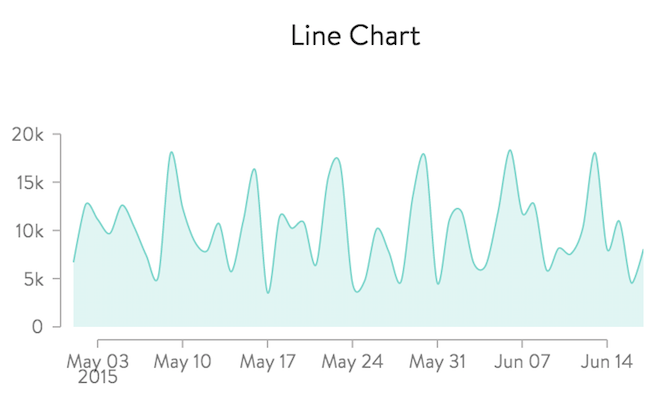
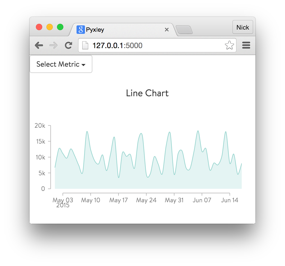
Charts
MetricsGraphics.js is an awesome library for making beautiful D3 charts. We’ve written a few wrappers to make it easier to integrate in our app. For those of you familiar with matplotlib, we are going to write code that is somewhat similar to the mpl API. We start with a Figure object and supply two things: a unique path that Flask will use for request routing and a unique element id that will be used by the React component. The figure is customizable, so let’s code up the desired aesthetics via Pyxley’s API.
fig = Figure("/mgchart/", "mychartid")
fig.graphics.transition_on_update(True)
fig.graphics.animate_on_load()
fig.layout.set_size(width=450, height=200)
fig.layout.set_margin(left=40, right=40)
All that remains is to pass our Figure object to the LineChart class and add it to the UI. In addition, we’ll supply the column name of the x-axis, a list of columns for the y-axis, some initial filter parameters, and provide an indicator that we are plotting a time-series.
lc = LineChart(df, fig, "Date", ["Value"], init_params={"Metric": "Steps"}, timeseries=True)
ui.add_chart(lc)
Transform to Javascript via PyReact
The final step is to compile the filters and charts into a single React jsx file, register it with the Flask app, and transform the jsx to Javascript using PyReact.
ui.render_layout(app, "./static/layout.js")
Including only the components mentioned above, we should get something that looks like:
How Does it Work?
Web Applications in Python
A very simple web application in Python might contain the following:
- Data source (e.g. SQLite database)
- HTML Template
- Request dispatching
- Javascript visualizations
Flask provides a great framework for handling the first three components. It’s very easy to set up an application to serve some static content such as a table or a plot. However, any interactive components are left to the developer to implement in Javascript. Pyxley helps bridge the gap and provides a set of Flask helper functions and wrappers for some basic Javascript widgets and charts.
React to the Rescue!
React.js is the perfect front-end complement to Flask. In addition to providing a succinct way of composing the UI elements of an application, React provides a simple structure through which we will integrate with Python. We’ve provided some basic React components in PyxleyJS that will handle most of the interaction between UI elements. The specifics of each component are passed through as React props. Integration with Python only requires a single template which is compiled into Javascript using PyReact.
PyxleyJS
We’ve simplified the process by making the assumption that most dashboards are a combination of filters and charts. Several useful components have been included in PyxleyJS. These components follow a very simple pattern: the user supplies props that determine which component is created. Let’s look at the Chart interface.
const Chart = React.createClass({
    getDefaultProps: function() {
        return {
            type: React.PropTypes.string.isRequired,
            options: React.PropTypes.object
        };
    },
    update: function(params) {
        this.refs.chart._update(params);
    },
    render: function() {
        var Z = ChartFactory(this.props.type);
        return (
            <Z ref={"chart"} options={this.props.options} />
        );
    }
});
Chart has two props: type and options. These props are used to determine the specific component we wish to render. In Python, we only need to specify the type and options, reducing the need to write obscure Javascript templates for every charting package. Instead, we simply need to write a single React component that initializes when the component mounts and updates when we call the update method. Following the same pattern we can create the entire UI with just a single React component composed of several charts and filters.
Flask Integration
Through PyReact and Jinja2 templating, we now have a way to integrate our React components with Python. The remaining pieces to constructing our web applications are:
- Setting up RESTful APIs to our data
- Providing interfaces to the React components
- Collecting and compiling the components
We wanted to accomplish the above while hiding as much complexity as possible from the user. Prioritizing simplicity led to the creation of the following two classes.
UIComponenta. Stores component type, options, and request routing functions b. Chart and Filter are subclassesUILayouta. Stores charts, filters, and registers routes with the Flask app
These classes only require the user to specify a unique identifier for the div component and a unique route for the request. The request route functions are determined by the type of chart or filter being created.
Pyxley and the Future
@wesmkinn we agree :)
While this initial release has only a few components, it introduces a very simple pattern that is easy to extend with minimal effort. More components will be added over time to both Pyxley and PyxleyJS and we welcome any contributions from the community and hope that this package makes developing dashboards in Python both simple and enjoyable.