When people think of “data science” they probably think of algorithms that scan large datasets to predict a customer’s next move or interpret unstructured text. But what about models that utilize small, time-stamped datasets to forecast dry metrics such as demand and sales? Yes, I’m talking about good old time series analysis, an ancient discipline that hasn’t received the cool “data science” rebranding enjoyed by many other areas of analytics.
Yet, analysis of time series data presents some of the most difficult analytical challenges: you typically have the least amount of data to work with, while needing to inform some of the most important decisions. For example, time series analysis is frequently used to do demand forecasting for corporate planning, which requires an understanding of seasonality and trend, as well as quantifying the impact of known business drivers. But herein lies the problem: you rarely have sufficient historical data to estimate these components with good precision. And, to make matters worse, validation is more difficult for time series models than it is for classifiers and your audience may not be comfortable with the embedded uncertainty.
So, how does one navigate such treacherous waters? You need business acumen, luck, and Bayesian structural time series models. In my opinion, these models are more transparent than ARIMA – which still tends to be the go-to method. They also facilitate better handling of uncertainty, a key feature when planning for the future. In this post I will provide a gentle intro the bsts R package written by Steven L. Scott at Google. Note that the bsts package is also being used by the CausalImpact package written by Kay Brodersen, which I discussed in this post from January.
Airline Passenger Data
An ARIMA Model
First, let’s start by fitting a classical ARIMA (autoregressive integrated moving average) model to the famous airline passenger dataset. The ARIMA model has the following characteristics:
- First order differencing (\(d=1\)) and a moving average term (\(q=1\))
- Seasonal differencing and a seasonal MA term
- The year of 1960 was used as the holdout period for validation
- Using a log transformation to model the growth rate
library(lubridate)
library(bsts)
library(dplyr)
library(ggplot2)
library(forecast)


### Load the data
data("AirPassengers")
Y <- window(AirPassengers, start=c(1949, 1), end=c(1959,12))

### Fit the ARIMA model
arima <- arima(log10(Y),
               order=c(0, 1, 1),
               seasonal=list(order=c(0,1,1), period=12))

### Actual versus predicted
d1 <- data.frame(c(10^as.numeric(fitted(arima)), # fitted and predicted
                   10^as.numeric(predict(arima, n.ahead = 12)$pred)),
                   as.numeric(AirPassengers), #actual values
                   as.Date(time(AirPassengers)))
names(d1) <- c("Fitted", "Actual", "Date")


### MAPE (mean absolute percentage error)
MAPE <- filter(d1, year(Date)>1959) %>% summarise(MAPE=mean(abs(Actual-Fitted)/Actual))

### Plot actual versus predicted
ggplot(data=d1, aes(x=Date)) +
  geom_line(aes(y=Actual, colour = "Actual"), size=1.2) +
  geom_line(aes(y=Fitted, colour = "Fitted"), size=1.2, linetype=2) +
  theme_bw() + theme(legend.title = element_blank()) +
  ylab("") + xlab("") +
  geom_vline(xintercept=as.numeric(as.Date("1959-12-01")), linetype=2) +
  ggtitle(paste0("ARIMA -- Holdout MAPE = ", round(100*MAPE,2), "%")) +
  theme(axis.text.x=element_text(angle = -90, hjust = 0))
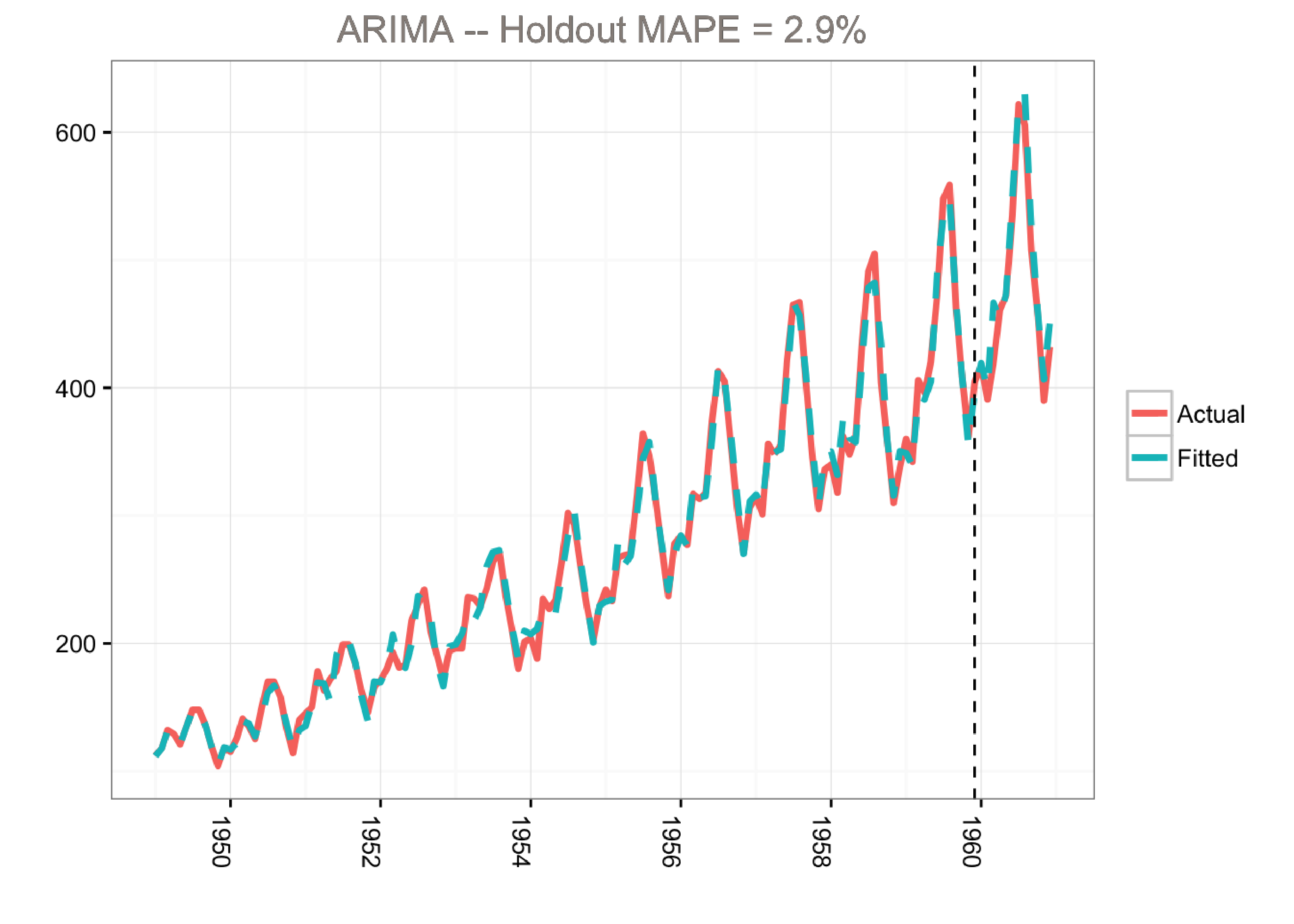
This model predicts the holdout period quite well as measured by the MAPE (mean absolute percentage error). However, the model does not tell us much about the time series itself. In other words, we cannot visualize the “story” of the model. All we know is that we can fit the data well using a combination of moving averages and lagged terms.
A Bayesian Structural Time Series Model
A different approach would be to use a Bayesian structural time series model with unobserved components. This technique is more transparent than ARIMA models and deals with uncertainty in a more elegant manner. It is more transparent because its representation does not rely on differencing, lags and moving averages. You can visually inspect the underlying components of the model. It handles uncertainty in a better way because you can quantify the posterior uncertainty of the individual components, control the variance of the components, and impose prior beliefs on the model. Last, but not least, any ARIMA model can be recast as a structural model.
Generally, we can write a Bayesian structural model like this:
\[\large Y_t = \mu_t + x_t \beta + S_t + e_t, e_t \sim N(0, \sigma^2_e)\] \[\large \mu_{t+1} = \mu_t + \nu_t, \nu_t \sim N(0, \sigma^2_{\nu}).\]Here \(x_t\) denotes a set of regressors, \(S_t\) represents seasonality, and \(\mu_t\) is the local level term. The local level term defines how the latent state evolves over time and is often referred to as the unobserved trend. This could, for example, represent an underlying growth in the brand value of a company or external factors that are hard to pinpoint, but it can also soak up short term fluctuations that should be controlled for with explicit terms. Note that the regressor coefficients, seasonality and trend are estimated simultaneously, which helps avoid strange coefficient estimates due to spurious relationships (similar in spirit to Granger causality, see 1). In addition, due to the Bayesian nature of the model, we can shrink the elements of \(\beta\) to promote sparsity or specify outside priors for the means in case we’re not able to get meaningful estimates from the historical data (more on this later).
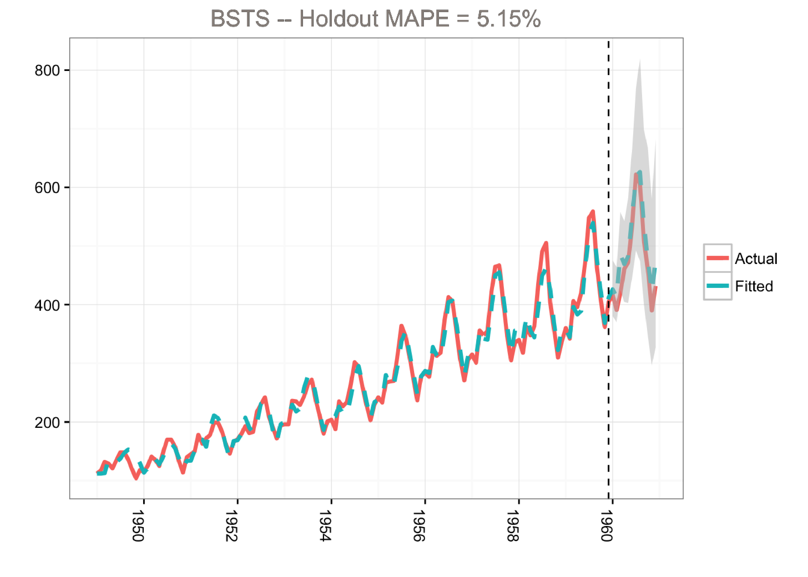
The airline passenger dataset does not have any regressors, and so we’ll fit a simple Bayesian structural model:
- 500 MCMC draws
- Use 1960 as the holdout period
- Trend and seasonality
- Forecast created by averaging across the MCMC draws
- Credible interval generated from the distribution of the MCMC draws
- Discarding the first MCMC iterations (burn-in)
- Using a log transformation to make the model multiplicative
library(lubridate)
library(bsts)
library(dplyr)
library(ggplot2)

### Load the data
data("AirPassengers")
Y <- window(AirPassengers, start=c(1949, 1), end=c(1959,12))
y <- log10(Y)


### Run the bsts model
ss <- AddLocalLinearTrend(list(), y)
ss <- AddSeasonal(ss, y, nseasons = 12)
bsts.model <- bsts(y, state.specification = ss, niter = 500, ping=0, seed=2016)

### Get a suggested number of burn-ins
burn <- SuggestBurn(0.1, bsts.model)

### Predict
p <- predict.bsts(bsts.model, horizon = 12, burn = burn, quantiles = c(.025, .975))

### Actual versus predicted
d2 <- data.frame(
    # fitted values and predictions
    c(10^as.numeric(-colMeans(bsts.model$one.step.prediction.errors[-(1:burn),])+y),
    10^as.numeric(p$mean)),
    # actual data and dates
    as.numeric(AirPassengers),
    as.Date(time(AirPassengers)))
names(d2) <- c("Fitted", "Actual", "Date")

### MAPE (mean absolute percentage error)
MAPE <- filter(d2, year(Date)>1959) %>% summarise(MAPE=mean(abs(Actual-Fitted)/Actual))

### 95% forecast credible interval
posterior.interval <- cbind.data.frame(
  10^as.numeric(p$interval[1,]),
  10^as.numeric(p$interval[2,]),
  subset(d2, year(Date)>1959)$Date)
names(posterior.interval) <- c("LL", "UL", "Date")

### Join intervals to the forecast
d3 <- left_join(d2, posterior.interval, by="Date")

### Plot actual versus predicted with credible intervals for the holdout period
ggplot(data=d3, aes(x=Date)) +
  geom_line(aes(y=Actual, colour = "Actual"), size=1.2) +
  geom_line(aes(y=Fitted, colour = "Fitted"), size=1.2, linetype=2) +
  theme_bw() + theme(legend.title = element_blank()) + ylab("") + xlab("") +
  geom_vline(xintercept=as.numeric(as.Date("1959-12-01")), linetype=2) +
  geom_ribbon(aes(ymin=LL, ymax=UL), fill="grey", alpha=0.5) +
  ggtitle(paste0("BSTS -- Holdout MAPE = ", round(100*MAPE,2), "%")) +
  theme(axis.text.x=element_text(angle = -90, hjust = 0))
Side Notes on the bsts Examples in this Post
- When building Bayesian models we get a distribution and not a single answer. Thus, the
bstspackage returns results (e.g., forecasts and components) as matrices or arrays where the first dimension holds the MCMC iterations. - Most of the plots in this post show point estimates from averaging (using the
colMeansfunction). But it’s very easy to get distributions from the MCMC draws, and this is recommended in real life to better quantify uncertainty. - For visualization, I went with
ggplotfor this example in order to demonstrate how to retrieve the output for custom plotting. Alternatively, we can simply use theplot.bstsfunction that comes with thebstspackage.
Note that the predict.bsts function automatically supplies the upper and lower limits for a credible interval (95% in our case). We can also access the distribution for all MCMC draws by grabbing the distribution matrix (instead of interval). Each row in this matrix is one MCMC draw. Here’s an example of how to calculate percentiles from the posterior distribution:
credible.interval <- cbind.data.frame(
  10^as.numeric(apply(p$distribution, 2,function(f){quantile(f,0.75)})),
  10^as.numeric(apply(p$distribution, 2,function(f){median(f)})),
  10^as.numeric(apply(p$distribution, 2,function(f){quantile(f,0.25)})),
  subset(d3, year(Date)>1959)$Date)
names(credible.interval) <- c("p75", "Median", "p25", "Date")
Although the holdout MAPE (mean absolute percentage error) is larger than the ARIMA model for this specific dataset (and default settings), the bsts model does a great job of capturing the growth and seasonality of the air passengers time series. Moreover, one of the big advantages of the Bayesian structural model is that we can visualize the underlying components. In this example, we’re using ggplot to plot the average of the MCMC draws for the trend and the seasonal components:
library(lubridate)
library(bsts)
library(ggplot2)
library(reshape2)

### Set up the model
data("AirPassengers")
Y <- window(AirPassengers, start=c(1949, 1), end=c(1959,12))
y <- log10(Y)
ss <- AddLocalLinearTrend(list(), y)
ss <- AddSeasonal(ss, y, nseasons = 12)
bsts.model <- bsts(y, state.specification = ss, niter = 500, ping=0, seed=2016)

### Get a suggested number of burn-ins
burn <- SuggestBurn(0.1, bsts.model)

### Extract the components
components <- cbind.data.frame(
  colMeans(bsts.model$state.contributions[-(1:burn),"trend",]),
  colMeans(bsts.model$state.contributions[-(1:burn),"seasonal.12.1",]),
  as.Date(time(Y)))
names(components) <- c("Trend", "Seasonality", "Date")
components <- melt(components, id="Date")
names(components) <- c("Date", "Component", "Value")

### Plot
ggplot(data=components, aes(x=Date, y=Value)) + geom_line() +
  theme_bw() + theme(legend.title = element_blank()) + ylab("") + xlab("") +
  facet_grid(Component ~ ., scales="free") + guides(colour=FALSE) +
  theme(axis.text.x=element_text(angle = -90, hjust = 0))
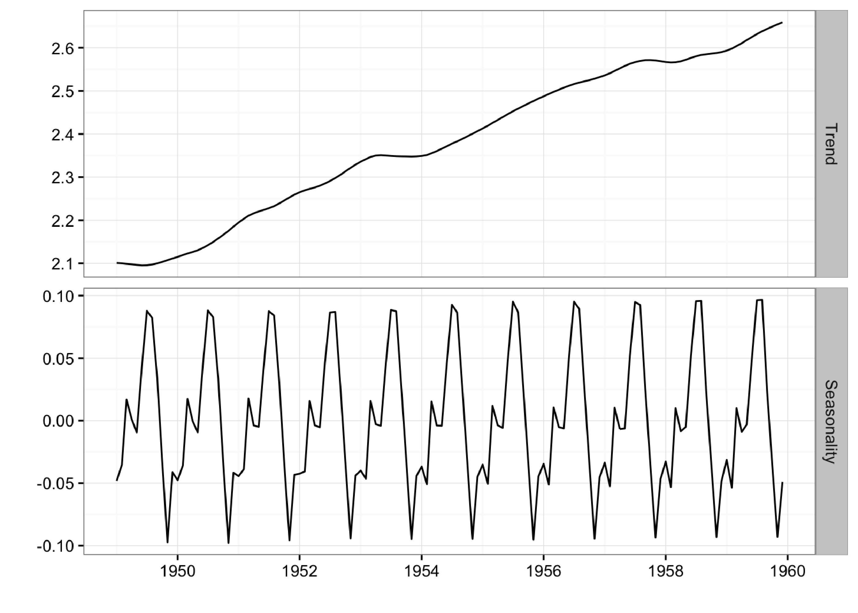
Here we can clearly the seasonal pattern of airline passengers as well as how the airline industry grew during this period.
Bayesian Variable Selection
Another advantage of Bayesian structural models is the ability to use spike-and-slab priors. This provides a powerful way of reducing a large set of correlated variables into a parsimonious model, while also imposing prior beliefs on the model. Furthermore, by using priors on the regressor coefficients, the model incorporates uncertainties of the coefficient estimates when producing the credible interval for the forecasts.
As the name suggests, spike and slab priors consist of two parts: the spike part and the slab part. The spike part governs the probability of a given variable being chosen for the model (i.e., having a non-zero coefficient). The slab part shrinks the non-zero coefficients toward prior expectations (often zero). To see how this works, let \(\tau\) denote a vector of 1s and 0s where a value of 1 indicates that the variable is selected (non-zero coefficient). We can factorize the spike and slab prior as follows (see 1) :
\[\large p(\tau, \beta, 1/\sigma^2_{\epsilon}) = p(\tau)p(\sigma^2_{\epsilon} \text{ } | \text{ } \tau) p(\beta \text{ } | \text{ } \tau, \sigma^2_{\epsilon})\]The probability of choosing a given variable is typically assumed to follow a Bernoulli distribution where the parameter can be set according to the expected model size. For example, if the expected model size is 5 and we have 50 potential variables, we could set all spike parameters equal to 0.1. Alternatively, we can also set individual spike parameters to 0 or 1 to force certain variables in or out of the model.
For the slab part, a normal prior is used for \(\beta\) which leads to an inverse Gamma prior for \(\sigma^2_{\epsilon}\). The mean is specified through the prior expectations for \(\beta\) (zero by default). The tightness of the priors can be expressed in terms of observations worth of weight (demonstrated later). For more technical information see 1 .
Using Spike and Slab Priors for the Initial Claims Data
Here’s an example of fitting a model to the initial claims data, which is a weekly time series of US initial claims for unemployment (the first column is the dependent variable, which contains the initial claims numbers from FRED). The model has a trend component, a seasonal component, and a regression component.
For model selection, we are essentially using the “spike” part of the algorithm to select variables and the “slab” part to shrink the coefficients towards zero (akin to ridge regression).
library(lubridate)
library(bsts)
library(ggplot2)
library(reshape2)
### Fit the model with regressors
data(iclaims)
ss <- AddLocalLinearTrend(list(), initial.claims$iclaimsNSA)
ss <- AddSeasonal(ss, initial.claims$iclaimsNSA, nseasons = 52)
bsts.reg <- bsts(iclaimsNSA ~ ., state.specification = ss, data =
initial.claims, niter = 500, ping=0, seed=2016)
### Get the number of burn-ins to discard
burn <- SuggestBurn(0.1, bsts.reg)
### Helper function to get the positive mean of a vector
PositiveMean <- function(b) {
b <- b[abs(b) > 0]
if (length(b) > 0)
return(mean(b))
return(0)
}
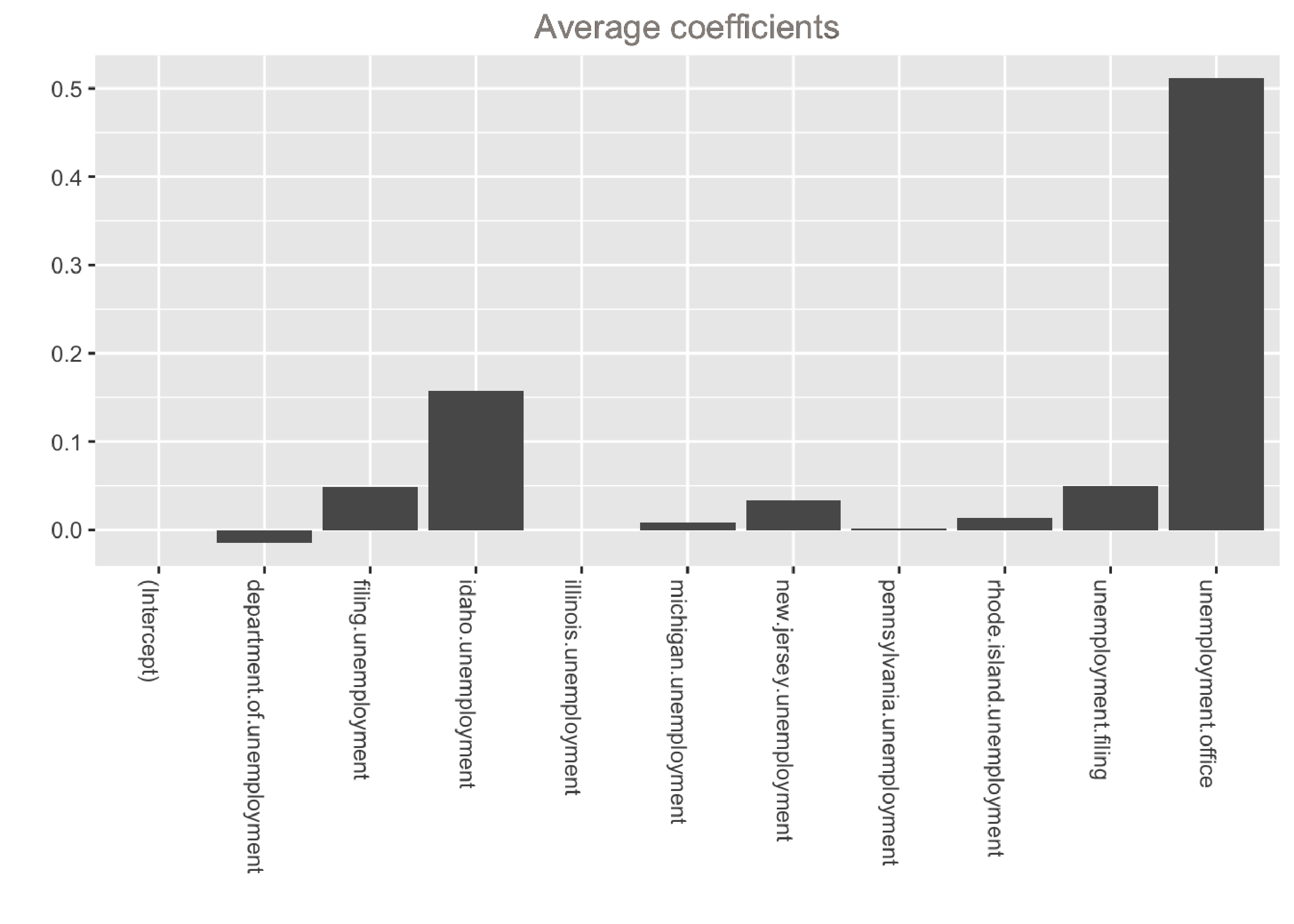
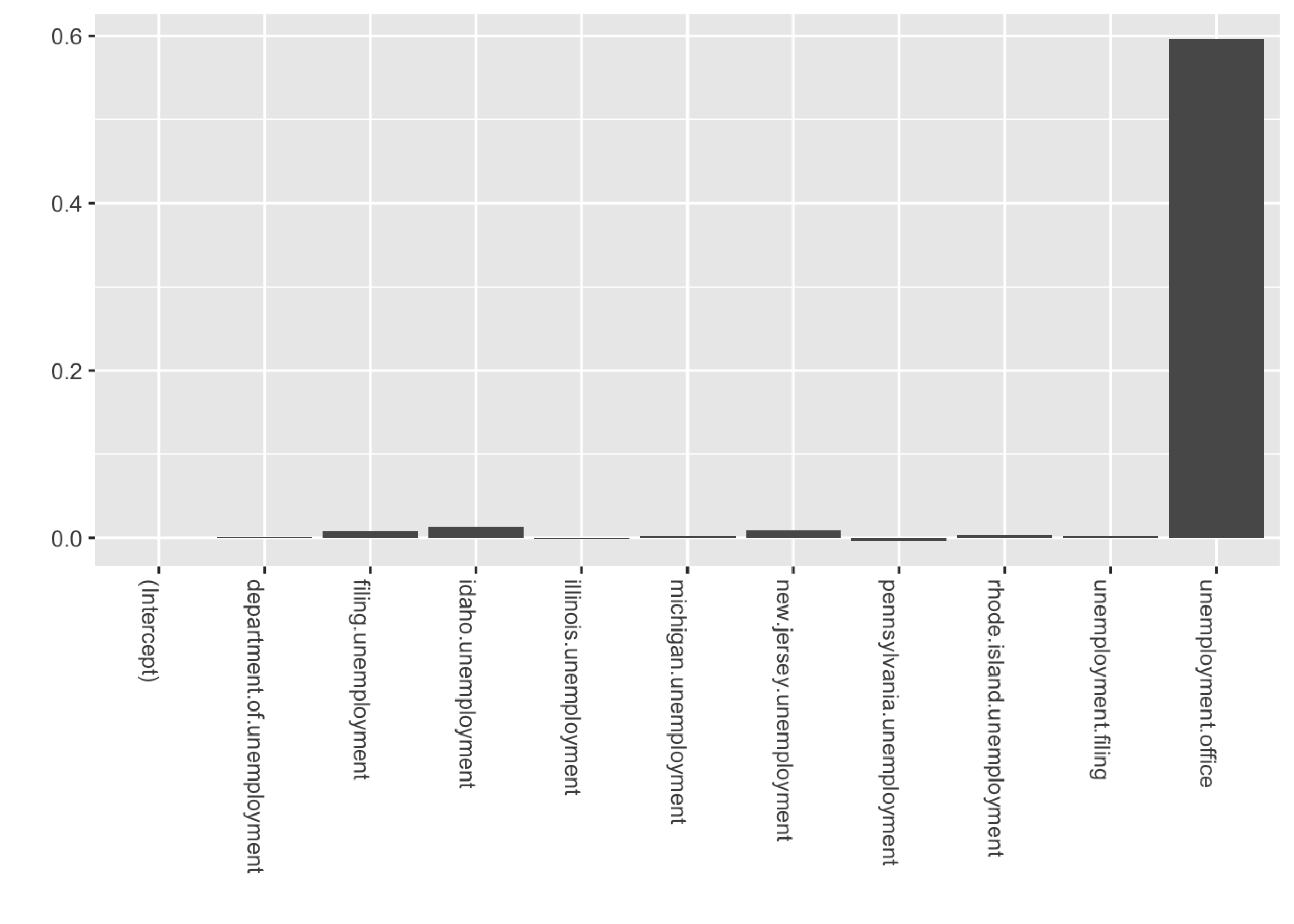
### Get the average coefficients when variables were selected (non-zero slopes)
coeff <- data.frame(melt(apply(bsts.reg$coefficients[-(1:burn),], 2, PositiveMean)))
coeff$Variable <- as.character(row.names(coeff))
ggplot(data=coeff, aes(x=Variable, y=value)) +
geom_bar(stat="identity", position="identity") +
theme(axis.text.x=element_text(angle = -90, hjust = 0)) +
xlab("") + ylab("") + ggtitle("Average coefficients")
### Inclusion probabilities -- i.e., how often were the variables selected
inclusionprobs <- melt(colMeans(bsts.reg$coefficients[-(1:burn),] != 0))
inclusionprobs$Variable <- as.character(row.names(inclusionprobs))
ggplot(data=inclusionprobs, aes(x=Variable, y=value)) +
  geom_bar(stat="identity", position="identity") +
  theme(axis.text.x=element_text(angle = -90, hjust = 0)) +
  xlab("") + ylab("") + ggtitle("Inclusion probabilities")
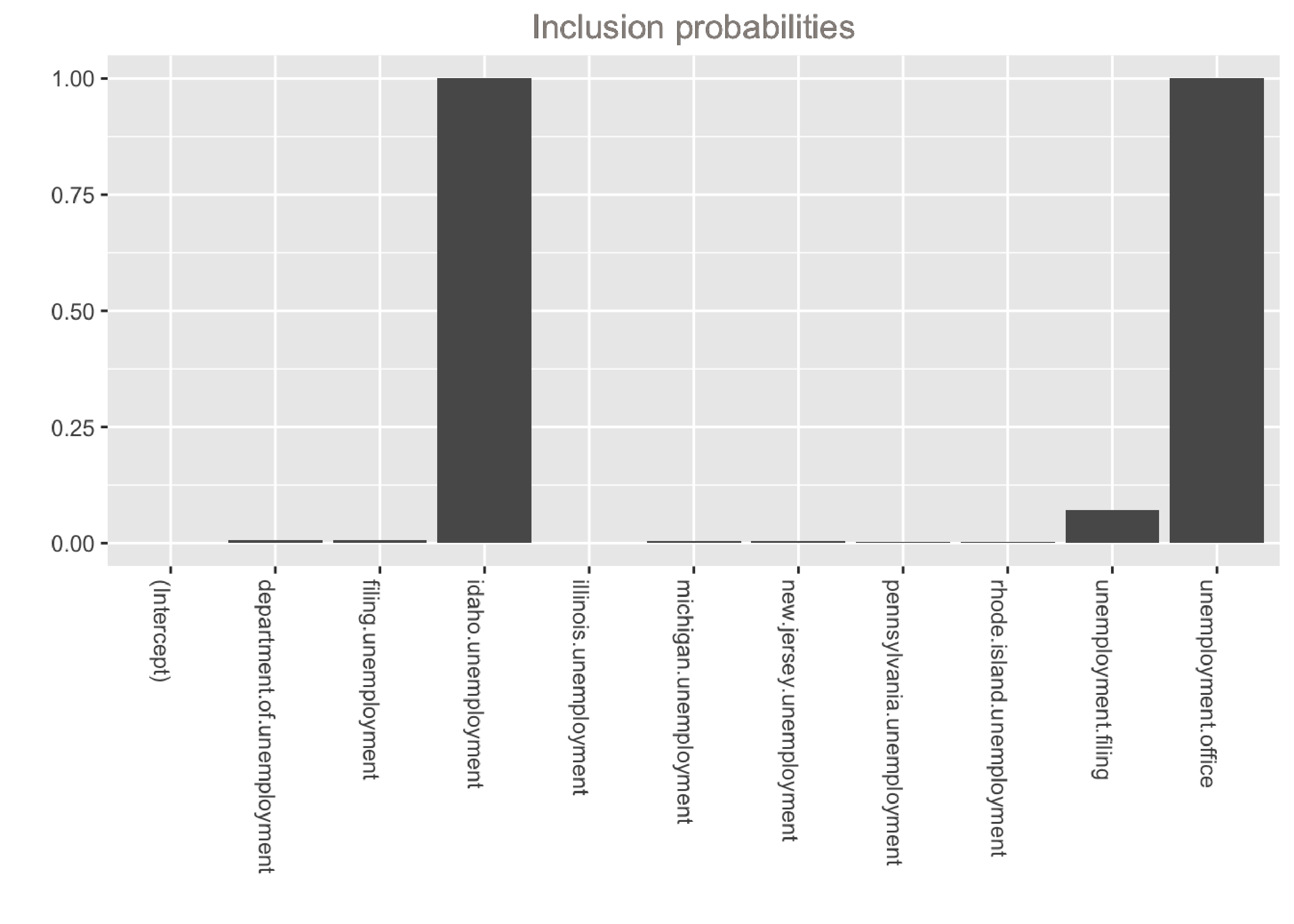
The output shows that the model is dominated by two variables: unemployment.office and idaho.unemployment. These variables have the largest average coefficients and were selected in 100% of models. Note that if we want to inspect the distributions of the coefficients, we can can simply calculate quantiles instead of the mean inside the helper function above:
P75 <- function(b) {
  b <- b[abs(b) > 0]
  if (length(b) > 0)
    return(quantile(b, 0.75))
  return(0)
}

p75 <- data.frame(melt(apply(bsts.reg$coefficients[-(1:burn),], 2, P75)))
And we can easily visualize the overall contribution of these variables to the model:
library(lubridate)
library(bsts)
library(ggplot2)
library(reshape2)
### Fit the model with regressors
data(iclaims)
ss <- AddLocalLinearTrend(list(), initial.claims$iclaimsNSA)
ss <- AddSeasonal(ss, initial.claims$iclaimsNSA, nseasons = 52)
bsts.reg <- bsts(iclaimsNSA ~ ., state.specification = ss, data =
initial.claims, niter = 500, ping=0, seed=2016)
### Get the number of burn-ins to discard
burn <- SuggestBurn(0.1, bsts.reg)
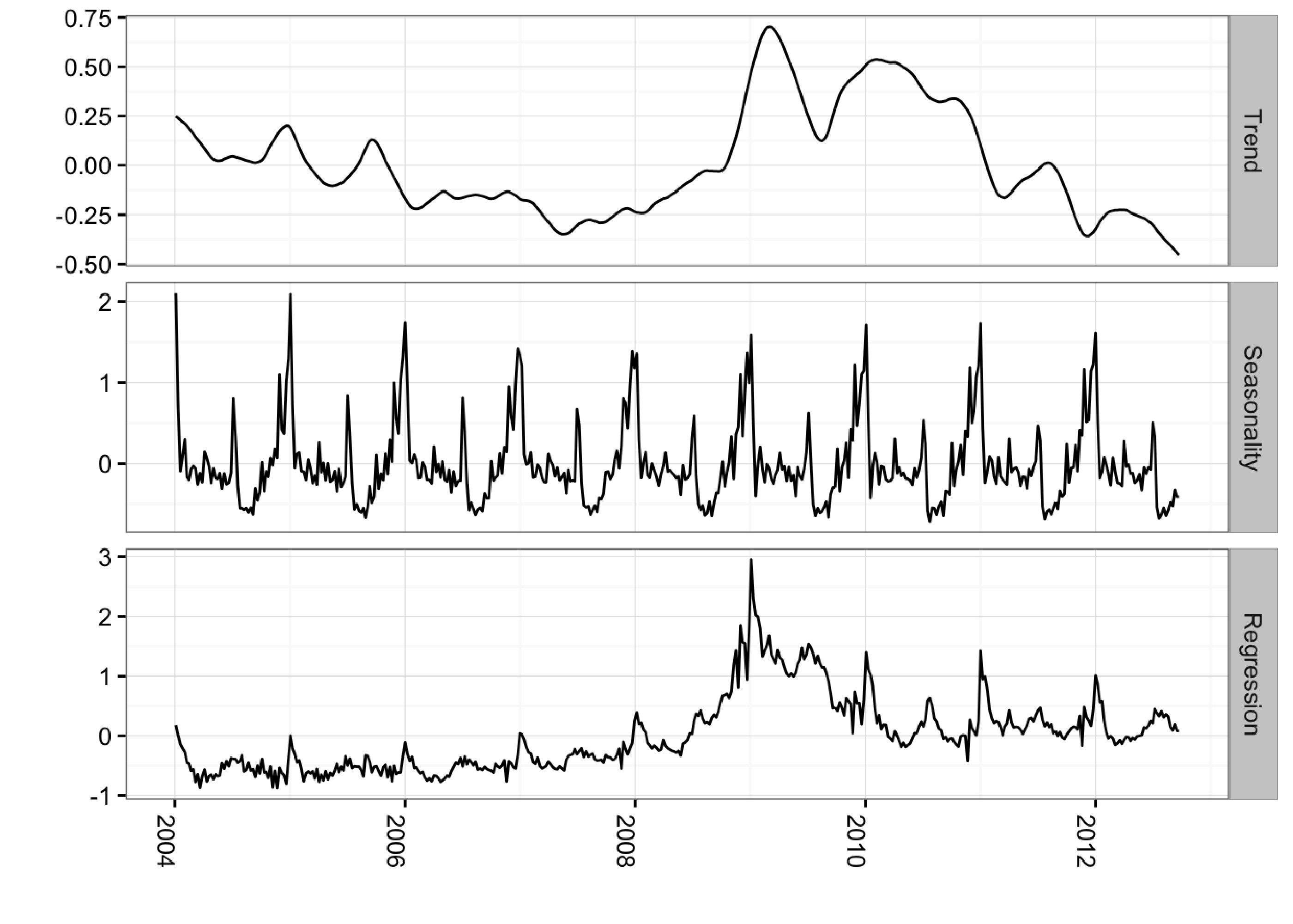
### Get the components
components.withreg <- cbind.data.frame(
colMeans(bsts.reg$state.contributions[-(1:burn),"trend",]),
colMeans(bsts.reg$state.contributions[-(1:burn),"seasonal.52.1",]),
colMeans(bsts.reg$state.contributions[-(1:burn),"regression",]),
as.Date(time(initial.claims)))
names(components.withreg) <- c("Trend", "Seasonality", "Regression", "Date")
components.withreg <- melt(components.withreg, id.vars="Date")
names(components.withreg) <- c("Date", "Component", "Value")
ggplot(data=components.withreg, aes(x=Date, y=Value)) + geom_line() +
theme_bw() + theme(legend.title = element_blank()) + ylab("") + xlab("") +
facet_grid(Component ~ ., scales="free") + guides(colour=FALSE) +
theme(axis.text.x=element_text(angle = -90, hjust = 0))
Including Prior Expectations in the Model
In the example above, we used the spike-and-slab prior as a way to select variables and promote sparsity. However, we can also use this framework to impose prior beliefs on the model. These prior beliefs could come from an outside study or a previous version of the model. This is a common use-case in time series regression; we cannot always rely on the data at hand to tell you how known business drivers affect the outcome.
In the bsts package, this is done by passing a prior object as created by the SpikeSlabPrior function. In this example we are specifying a prior of 0.6 on the variable called unemployment.office and forcing this variable to be selected by setting its prior spike parameter to 1. We’re giving our priors a weight of 200 (measured in observation count), which is fairly large given that the dataset has 456 records. Hence we should expect the posterior to be very close to 0.6.
library(lubridate)
library(bsts)
library(ggplot2)
library(reshape2)

data(iclaims)

prior.spikes <- c(0.1,0.1,0.1,0.1,0.1,0.1,0.1,0.1,0.1,1,0.1)
prior.mean <- c(0,0,0,0,0,0,0,0,0,0.6,0)

### Helper function to get the positive mean of a vector
PositiveMean <- function(b) {
  b <- b[abs(b) > 0]
  if (length(b) > 0)
    return(mean(b))
  return(0)
}

### Set up the priors
prior <- SpikeSlabPrior(x=model.matrix(iclaimsNSA ~ ., data=initial.claims),
                        y=initial.claims$iclaimsNSA,
                        prior.information.weight = 200,
                        prior.inclusion.probabilities = prior.spikes,
                        optional.coefficient.estimate = prior.mean)

### Run the bsts model with the specified priors
data(iclaims)
ss <- AddLocalLinearTrend(list(), initial.claims$iclaimsNSA)
ss <- AddSeasonal(ss, initial.claims$iclaimsNSA, nseasons = 52)
bsts.reg.priors <- bsts(iclaimsNSA ~ ., state.specification = ss,
                        data = initial.claims,
                        niter = 500,
                        prior=prior,
                        ping=0, seed=2016)


### Get the average coefficients when variables were selected (non-zero slopes)
coeff <- data.frame(melt(apply(bsts.reg.priors$coefficients[-(1:burn),], 2, PositiveMean)))
coeff$Variable <- as.character(row.names(coeff))
ggplot(data=coeff, aes(x=Variable, y=value)) +
  geom_bar(stat="identity", position="identity") +
  theme(axis.text.x=element_text(angle = -90, hjust = 0)) +
  xlab("") + ylab("")
As we can see, the posterior for unemployment.office is being forced towards 0.6 due to the strong prior belief that we imposed on the coefficient.
Last Words
Bayesian structural time series models possess three key features for modeling time series data:
- Ability to incorporate uncertainty into our forecasts so we quantify future risk
- Transparency, so we can truly understand how the model works
- Ability to incorporate outside information for known business drivers when we cannot extract the relationships from the data at hand
Having said that, there is no silver bullet when it comes to forecasting and scenario planning. No tool or method can remove the embedded uncertainty or extract clear signals from murky or limited data. Bayesian structural modeling merely maximizes your chances of success.
Getting the Code Used in this Post
github repo. Use the .Rmd file.
1 CausalImpact version 1.0.3, Brodersen et al., Annals of Applied Statistics (2015). http://google.github.io/CausalImpact/ ←
2 Predicting the Present with Bayesian Structural Time Series, Steven L. Scott and Hal Varian, http://people.ischool.berkeley.edu/~hal/Papers/2013/pred-present-with-bsts.pdf.